


Introduction
Survey planning typically begins with establishing goals for data collection. For example, a survey management team may set a specific minimum response rate target and maximum data collection budget. Depending on the needs of the survey, additional targets can be established to reflect data quality, representativeness, or other key outcomes. Targets can be set at the overall survey level or for key sample domains and may represent final or interim statuses. Establishing targets helps identify the strategy and resources needed; however, careful planning and measurement before and during the course of data collection is crucial if the goals are to be achieved.
Depending on the complexity of the survey design employed, monitoring progress toward data collection goals can present considerable challenges. Faced with an abundance of paradata (Couper & Lyberg, 2005), survey researchers can be overwhelmed by the amount and variety of information available to inform decisions during data collection. This is especially true in the case of longitudinal surveys, which may use survey data and paradata from multiple past waves of data collection to tailor approaches for specific groups of cases in the current wave. Such strategies are employed in responsive and adaptive survey designs (Groves & Heeringa, 2006; Schouten et al., 2017). Under these designs, data can inform decisions that may involve switching to an alternative protocol, halting the pursuit of some or all cases, initiating additional contact attempts, or fielding other interventions.
To address the challenges presented by decision making in a data-rich context, visualization can serve as a valuable tool to express data as readily interpretable media. Furthermore, interactive visualizations that allow the end user to rapidly produce ad hoc reports may provide additional utility to project staff. In this paper, we describe the process of designing a suite of visualization tools for survey data collection enclosed in a system called the Adaptive Total Design (ATD) Dashboard. This system is designed for monitoring and visualizing data from multiple sources to track experimental, multimode, and longitudinal survey designs in near–real time.
Using an extensible web application framework for the R programming language, the ATD platform standardizes the approach to, and production of, easily interpretable data visualizations and reports. Users are presented with an array of display options and tools for categorizing, subsetting, and aggregating data. For longitudinal studies, graphs that overlay projections, display information from prior rounds, and incorporate both survey data and paradata can be made available.
Given that data inputs may be derived from disparate systems and may exist at multiple units of analysis (e.g., sample member, interviewer, day, region), we constructed a data taxonomy embedded into display and selection mechanisms to allow only logical combinations. Critical quality indicators are prominently displayed, while extraneous information is minimized, following best practices of visual design (e.g., Cleveland, 1993; Tufte, 2001). Our design process and decisions can be informative to others who are considering the development of a data collection monitoring system or to those who are reevaluating current solutions.
Our case study for the presentation of the ATD Dashboard and its features is the National Longitudinal Study of Adolescent to Adult Health (known as Add Health). We use the dashboard to regularly review the interim results of current sample data collection for the planning of protocols for subsequent samples. We highlight the dashboard visualizations used for Add Health given its longitudinal design and complexity of design decisions required during data collection. We conclude with a discussion of additional features planned for the next wave of Add Health.
Description of Add Health
Add Health is a longitudinal survey funded by the Eunice Kennedy Shriver National Institute of Child Health and Human Development, with cooperative funding from 23 other federal agencies and foundations, and led by investigators at the Carolina Population Center at the University of North Carolina at Chapel Hill. RTI International is collecting current wave (Wave V) survey data. Add Health combines data on respondents’ social, economic, psychological, and physical well-being with contextual data on the family, neighborhood, community, school, friendships, peer groups, and romantic relationships (Harris, 2010, 2013). This design provides unique opportunities to study how social environments and behaviors in adolescence are linked to health and achievement outcomes in young adulthood.
Add Health began with a nationally representative sample of adolescents in grades 7–12 in the United States during the 1994–95 school year. This cohort was followed into young adulthood with four successive in-home interviews, the most recent in 2008 when sample members were ages 24–32. In 2016, Add Health launched a fifth wave (Wave V) to collect social, environmental, behavioral, and biological data from 19,828 eligible sample members. The Wave V results will be used to track the emergence of chronic disease as the cohort moves through their fourth decade of life.
Wave V is the first collection for Add Health to employ a mixed mode, two-phase design. In the first phase, sample members were contacted primarily by mail and email and asked to complete either a web or a paper questionnaire. In the second phase, we sampled nonrespondents and visited their households, where they completed the web interview on a computer laptop. Most of the remaining nonrespondents were contacted by phone to complete a short interviewer-administered version of the survey.
Before data collection, the survey designers split Wave V cases randomly into four subsamples, which were released sequentially between 2016 and 2018. The protocol for data collection for each subsample reflected lessons learned from the prior data collections, meaning that interim results were needed to determine which strategies were most effective before the next subsample was released. Figure 1 provides a graphical overview of the design of the Wave V samples.
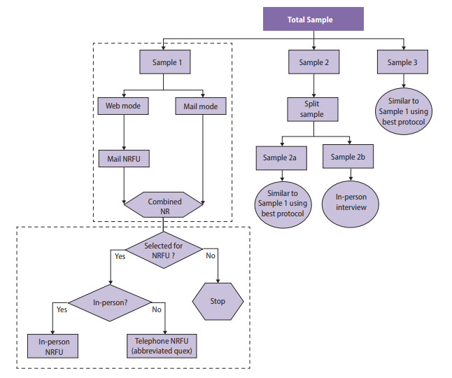
Sample 1 included a 2×2 factorial experiment to test two incentive strategies and two versions of the questionnaire. One factor was the incentive structure, in which a random 50 percent subsample received a uniform incentive amount and the other 50 percent received an amount determined by their estimated propensity to respond (i.e., low propensity were offered a higher incentive). The propensity scores were derived using a predictive model fit to data gathered in prior waves of the survey. A second factor tested whether a single long questionnaire or two shorter (modular) questionnaires were more effective in obtaining full participation from sample members (Biemer et al., 2018).
Sample 2 included an experiment to determine whether a $10 preincentive was an effective means of raising response rates either alone or in combination with a prenotice card (Griggs et al., 2018). Lessons learned from these experiments were incorporated in the design of subsequent Wave V samples and will be used for planning Wave VI as well.
The variety and complexity of survey samples and treatments for Add Health Wave V necessitated an organized system for monitoring data collection. Monitoring was key to determine whether experimental treatments or other nonexperimental features were effective in the early stages of data collection as the planning for subsequent samples was ongoing. Those treatments found effective in earlier samples were selected for inclusion in later samples.
Note that the data we present in this paper do not necessarily reflect the final survey outcomes, as Wave V was still in progress as of the time of writing. All estimates presented are unweighted. Further, to protect the confidentiality of the data, some values were perturbed to modify their original values. Readers are cautioned to not interpret the values presented as actual Add Health estimates.
Throughout this paper, we present examples from Add Health Wave V to illustrate the development of the ATD Dashboard from a static to an interactive tool. The design decisions we considered are common to such a transformation, and the solutions identified can be applied to other applications requiring interactivity.
Adaptive Total Design (ATD) Framework
Before beginning data collection, it is important to define what “success” means for the aims of a particular survey. This often involves discussing the study goals with the survey sponsors and data collection team to identify which metrics are most important to track and which combination of values will indicate whether the goals have been met. Metrics can be related to quality, cost, schedule, or other dimensions and can be constructed in myriad ways. Key to monitoring data collection is determining how best to track progress toward project-defined goals. This is especially important in studies employing elements of adaptive or responsive designs.
Critical-to-quality (CTQ) metrics are central to the continuous quality improvement (CQI) approach outlined in Biemer, 2010 . The approach begins with preparing a workflow diagram of the process (as in Figure 1). Next, the team establishes CTQ metrics. CTQs are then continuously monitored during the data collection process. Finally, interventions are used as necessary to ensure that costs and quality are within acceptable limits. An extension of this approach specific to complex survey design is termed adaptive total design (ATD) (Biemer, 2010; Eltinge et al., 2013). A defining feature of ATD is the consideration of interactions across error sources by monitoring several quality indicators simultaneously. This is not a requirement of the CQI approach but is essential for complex survey management. Hence, ATD serves as the conceptual framework for our dashboard. Regardless of the metrics identified as key, it can be challenging to simultaneously monitor multiple metrics, especially when monitoring is needed at different levels (e.g., respondent groups identified from prior waves, respondents by area, or the work of individual interviewers or groups of interviewers).
Static Visualizations
Data collection efforts often involve compiling reports in the form of tables and regularly monitoring such reports. These tables can be effective to assure project staff that protocols are working as intended or to inform interventions that may be necessary to keep production on the desired course. However, the size, dimensions, and quantity of these tables may obfuscate trends or patterns. For example, Figure 2 presents data from Add Health Wave V showing the cumulative completion rate of cases by a randomly assigned treatment to receive a prenotice letter and by response propensity group, as determined by data gathered in prior rounds. Due to space limitations, we present only a sample of days in the data collection period.
For Add Health, it was important to monitor the performance of the different treatments—such as the prenotice letter—across propensity groups during data collection to adequately plan for the next sample release for data collection. However, the tabular view made it difficult for data collection staff to quickly glean meaning from the numbers. Such situations are common in survey data collection monitoring when a team has the required data for review and decision making, but the data appear in a format that inhibits the rapid identification of patterns.
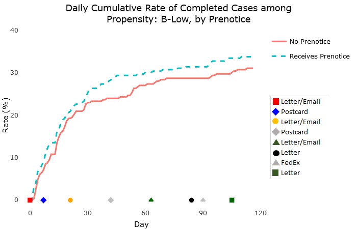
To provide data collection staff with tools to more quickly gain insights from regular monitoring, we first used a static visualization report format. The development of the static reports is discussed in Murphy, Biemer, and Berry (2018). In short, the reports eliminate any elements that are not helpful for quick interpretation of the data, such as excessive gridlines, nonmeaningful uses of color, and redundant labels. The reports followed best practices of data visualization, using, for example, line charts connecting individual numeric data points to display cumulative trends. An example of the static charts produced for the Add Health reports is shown in Figure 3. This chart, which was produced for all propensity levels, shows an example of monitoring the cumulative completion rate for groups who did and did not receive the prenotice letter during data collection. The graphical format, in addition to making immediately clear the progress by treatment, allows for the inclusion of other information, such the timing of various respondent mailings, along the X-axis. This format can serve as a model for those seeking a simple, clear graphical design for monitoring time trends.

While the static reports were much more helpful for monitoring than the tabular views, they limited users to preprogrammed views. Users of the dashboard could not investigate a trend in more detail, for example by selecting subsets of the data, narrowing in on certain date ranges, or viewing trends for certain geographic areas. Our desire for users to be able to customize the view of the charts and interact with the content led us to investigate interactivity.
Interactive Visualizations
Supporting Ad Hoc Analyses Using R and Shiny
Static data visualizations can meaningfully improve the ability of project staff to monitor the most essential metrics of a survey, but by nature, they are unable to actively support ad hoc analyses. This limitation can become acutely noticeable when multiple project stakeholders share differing interests. For example, field supervisors may be principally interested in the performance of the interviewers for whom they are responsible, while statisticians may wish to monitor measures of potential bias over time, whereas cost measures and response rates may be among project management staff’s primary concerns. This is a common situation in complex surveys. In Add Health, the diversity of the project team managing the complex design necessitated a platform that supports exploration and examination of a variety of data.
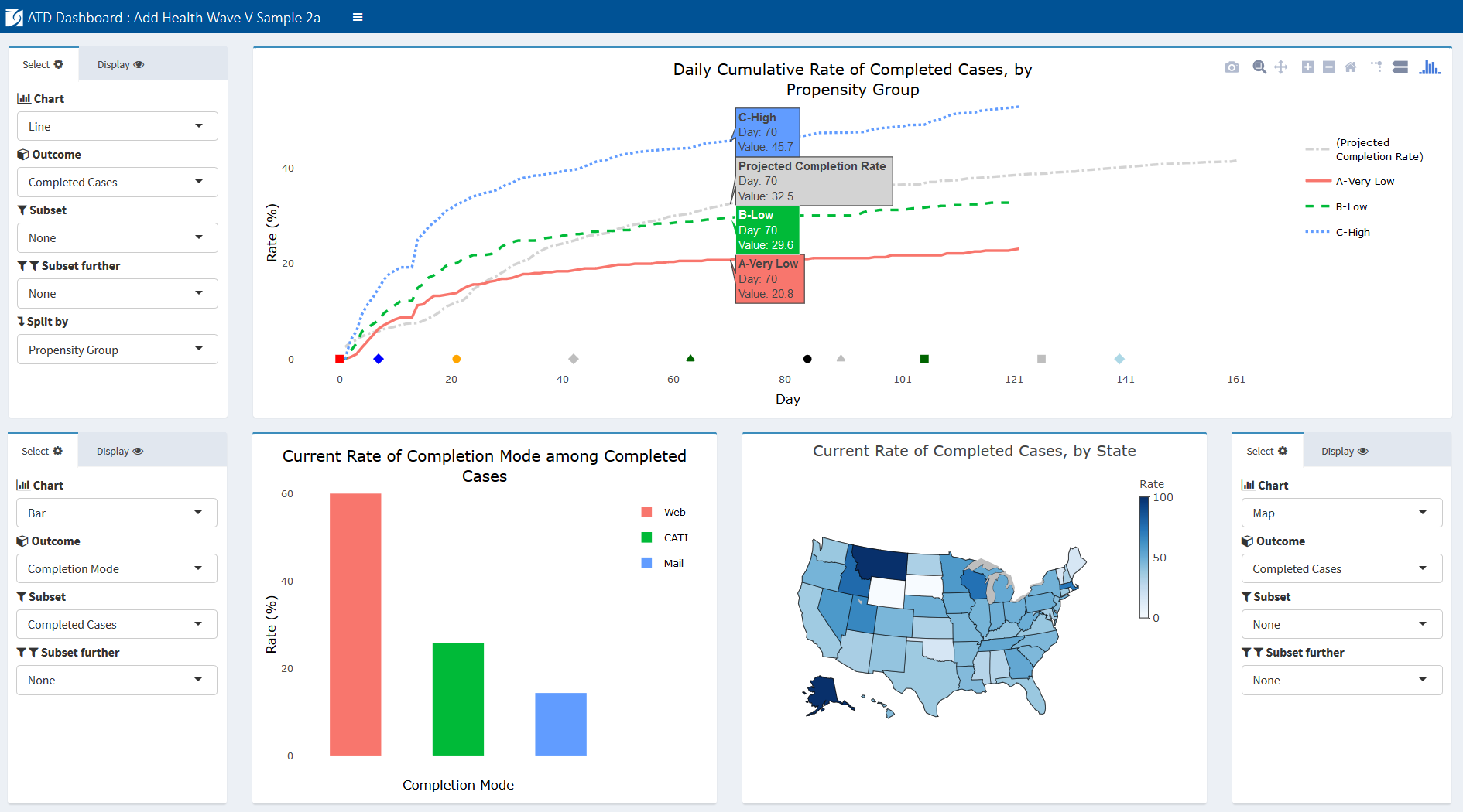
We present an example snapshot of the interactive Add Health ATD Dashboard in Figure 4 as context for the discussion of its development. Later figures present individual charts for specific measures.

The goal of the ATD Dashboard is to build upon the format of the static ATD reports and give users flexible control over content and view. Using the Shiny framework (Chang et al., 2018) and R programming language, we developed a web-based dashboard allowing survey staff to view daily results of data collection. Shiny, an open-source R package, allows users to easily layer a front-end interface on top of R. This relationship means that an application, such as the ATD Dashboard, can incorporate the standard R packages with which survey researchers are familiar—packages that give users access to advanced statistical tools—while allowing end users to interact with the underlying analyses. One of the design goals included having complete control over charting types and display options, which R and Shiny afforded the programming team. A further advantage of R and Shiny over commercial platforms is the fact that they are free and open-source. Finally, although the dashboard is written using R and Shiny, project staff as end users do not need to be familiar with the programming language and structure of the system. In our experience, these considerations are common to many survey projects; hence, we find the Shiny framework to be promising for those considering a software solution for dashboard deployment.
Data can be viewed in numerous ways, allowing filtering on secondary variables, overlaying projections, and selecting unique time frames of interest. The dashboard provides a more efficient means of tracking study data than reviewing large and unwieldy tables and provides added flexibility over static reports in the support of analyses for multiple stakeholders.
The platform was designed with the idea of reducing burden at every step of the process—from the project programmer preparing data inputs to the end user. For programmers, the standard data taxonomy only requires that programmers assign a class and role to each variable included and format using the “id | variable | value | date” layout. Once this is established at the beginning of the project, subsequent updates only require refreshing the underlying data. The charts themselves do not require any modification before they can be used. For end users, the platform includes only the most relevant measures and allows only logical combinations of values. For example, if a user is interested in viewing the rate of mobile completes (web surveys completed via mobile device), the dashboard will allow users to view them as a percentage of all cases, all completes, or web completes. However, the dashboard will not allow users to view mobile completes as a percentage of mail completes, since this is not logically possible.
The roles of each variable are identified at the outset of the study via the data taxonomy and do not require updating during data collection, unless a change is implemented in the design necessitating an update. Finally, the platform was constructed such that new teams adopting the tool do not need to make substantive modifications to deploy the system for their projects, and the platform can be hosted securely on a project website or share drive with minimal set-up.
Dashboard Functionality
The interactive dashboard offers a range of functionality not available with the static charts. Users are able to select options to create custom views. Specifically, users have the following options to update and interact with the charts on the screen:
-
Chart type: Options under the Chart dropdown list include line, bar, map, scatterplot, and table views.
-
Selecting an outcome: All available outcome metrics are listed under an Outcomes dropdown list. These represent the key metrics being monitored and can be tailored for each study. For example, the Add Health outcomes include completed cases, refusals, interviewer hours per complete, and rate of undeliverable mailings, among several others.
-
Subsetting: The subset of interest for a particular metric (for example, female sample members) can be selected by users under the Subset dropdown. To further subset (for example, female college graduates), users can select another variable under the subset further dropdown. Users can also display or hide individual groups in the chart by clicking and double-clicking on the group in the legend.
-
Splitting: To view an outcome by some split in the data (for example, female vs. male sample members), users can select the relevant variable from the Split by dropdown.
-
Projections: Often, a project will need to track an outcome against a predefined target or projection. For example, on Add Health, we tracked the rate of completed cases against a predefined target rate over the course of data collection that was created based on prior wave actuals and current assumptions. To add a projection (e.g., expected response rate) to a chart, users can select from the Projections dropdown.
-
Rate vs. Count: To toggle between displaying a rate or a count, users can select the appropriate setting under the Rate or Count dropdown.
-
Axis limits: For line charts, users can enter X limits and Y limits.
-
Gridlines: Users can turn gridlines on and off using the Gridlines checkbox.
-
Sort order: For bar charts, the default view is for bars to be ordered by their descending value. Users can change this to alphabetical order using the Sort dropdown.
-
Adding charts: Users can add chart panels to the dashboard by selecting Insert Rows.
-
Saving current charts: Users can bookmark their current view by selecting Bookmark Panels. This produces a URL to return to the current view.
-
More display options: Users can save the charts as PNG files, pan, zoom in/out, reset the axes, turn on hover tooltips for all series, and customize the views in other ways.
This functionality is enabled by a standardized input data structure and taxonomy, as we discuss next.
Structure of Input Data
To serve the interests of multiple stakeholders, data must be extracted from a variety of separate data collection and management systems. To reduce the burden on staff preparing the data, the data used to populate the charts in the ATD Dashboard are stored in a single comma-separated values (CSV) file using a narrow/stacked data file to populate the dashboard for a project. The following four columns are used:
-
ID (id) contains a value identifying the unit within a specified level.
-
Variable name (var) contains the name of a variable within a specific level. For instance, Completed at the cases level could be used as a variable indicating which cases have been completed.
-
Value (val) contains the value for a given variable. As discussed later, the dashboard accepts several different classes of values.
-
Date/time (dt) contains the date (and time) that a value was created. This component is typically associated with some event during data collection, such as the date on which a respondent completed the survey.
At the top of the input file, two blocks of metadata records are required to provide the dashboard with more information about the survey.
The first metadata block enables users to place markers on the X-axis (i.e., the axis of time) of line charts indicating when certain events took place during data collection. These are often used to show when mailouts occurred, when refresher interviewer training took place, when a new phase of data collection began, etc. but could represent any arbitrary event. A Start Date marker is defined first, followed by one record for all other markers. Rather than dates, the axis markers refer to the number of days after the start date, where the value for Start Date is set to zero. By using a relative, rather than absolute, reference system (i.e., days rather than dates), the platform can accommodate multi-wave data collections, which may have events that occur at different absolute dates but share common relative days across waves, such as a postcard mailout occurring 30 days after a release of cases. Figure 5 provides an example of the axis markers portion of an input file. Note that in the example provided, the data collection protocols (i.e., events in the Var column) are numbered in the order in which they occurred.
Data Taxonomy
The second type of metadata record contains information about each variable’s level, stage, and type. Collectively, we refer to these three attributes as a variable class. The class is shown in the Val column. For example, a class of samp_pre_cat would indicate a variable is at the sample (samp) level, refers to the preload (pre) phase of the survey, and is of a categorical (cat) type. Figure 6 provides an example of a block of variable classes.
Data at the Unit of Analysis
The final type of record in the input file provides unit-level information to populate the charts. For example, if the sample case is the unit of analysis for a completion rate, the input file includes one record for each case under the variable name all cases with the date of sample release in the dt column. There is then an additional record for each case under the completed cases variable for each case that has completed an interview. The dt column provides the date on which the interview was completed. Together, these variables can be used to display the rate or count of completes as of the most current day in the data collection period, by day, and as a cumulative or noncumulative measure. Figure 7 presents an example of unit-level information for all cases and completed cases.
Deployment and Hosting
To share the dashboard widely with the larger data collection team and survey managers, the ATD Dashboard was hosted on a web server using the open-source version of RStudio Shiny Server (https://www.rstudio.com/products/shiny/shiny-server/). R Shiny Server allows applications built in Shiny to be deployed to the web or shared within a closed network behind a firewall. To provide security for the Add Health paradata, the dashboard was hosted on an internal server behind our organization’s firewall. Additionally, we implemented basic authentication for site access, requiring users to provide a validated username and password to view the dashboard. For reproducibility and to aid in future deployment to other servers, both Shiny Server and an NGINX web server (used as a reverse proxy to redirect requests) were configured and deployed in Docker containers.
Add Health Examples
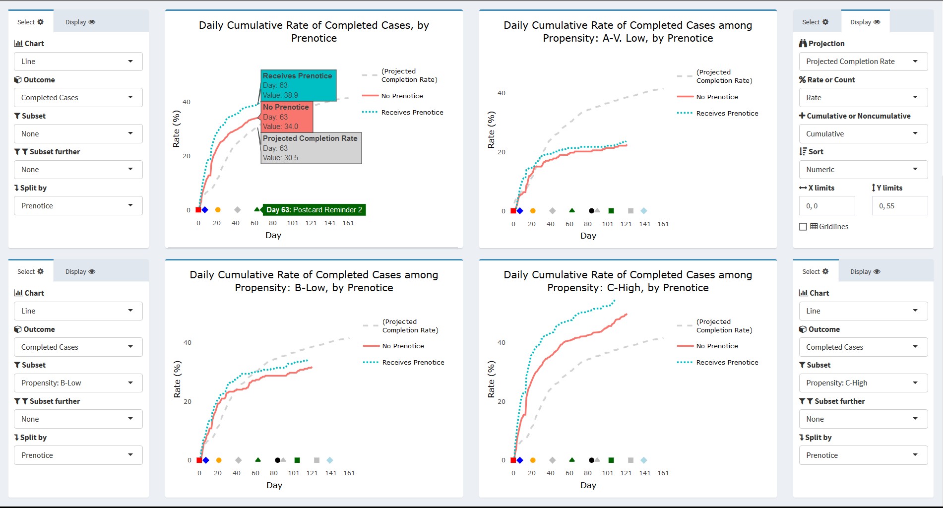
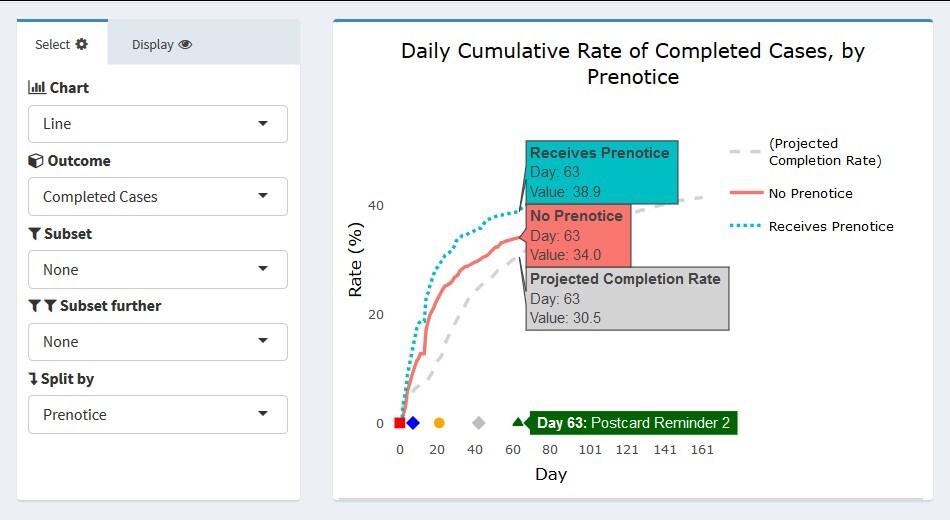
In this section, we present some actual images from the interactive Add Health ATD Dashboard. The first example uses the data partially displayed in Figures 2 and 3. We are interested in tracking the progress of cases that did and did not receive a prenotice letter partway through the data collection period. Further, we would like to know whether the patterns seen are similar or different based on response propensity level. Figure 8 presents four line graphs populated in the dashboard using the control panels to the side of each chart. The outcome completed cases is selected in each chart, and the projected completion rate for the entire sample is overlaid. For the dashboard, the projections can include expected rates determined before the start of data collection, forecast values updated during the course of data collection, or results from prior rounds for comparison. As with other unit-level records, projections are included in the input data file.

For the Add Health example, the projection line represents the target determined before the start of data collection. This projection was created using realized outcomes in prior waves and assumptions for the current samples’ methods (e.g., web/mail data collection). In the upper left panel, the view for all sample cases is shown. Users can hover their cursor over a value or day of interest to obtain its exact value. In Figure 8, a user has hovered over data collection day 63. The label next to the X-axis marker indicated this is the day on which Postcard Reminder 2 was mailed to respondents. The projected completion rate overall was 30.5 percent. As indicated, both the no-prenotice and prenotice groups achieved completion rates slightly higher than this projection by day 63 (34.0 and 38.9 percent, respectively). The completion rate for both groups follows a logarithmic pattern, but the initial returns came in more rapidly for the prenotice group, suggesting it had a positive effect in capturing respondents’ interest beyond the first survey mailing alone.
The remaining three panels in Figure 8 show the rate of completed cases subset to the three response propensity groups: very low, low, and high. As expected, response overall is lowest for the very low propensity group and highest for the high propensity group. Interestingly, there appeared to be little difference in the completion rates of the no prenotice and prenotice groups for very low propensity groups. The effectiveness of the prenotice appears to increase with higher response propensity. This suggests that the prenotice may be effective overall but may not be particularly effective for very low response propensity cases and that other methods may be required if a boost in completion rate is desired for this group. Of course, the results shown are cursory and do not currently include sample weights or options for significance testing to confirm the differences seen, however users could identify the need for this test upon quickly viewing the graphical patterns. We plan to build such functionality directly into the dashboard for the next wave of Add Health.
Figure 9 provides a closer view of the upper left panel from Figure 8.
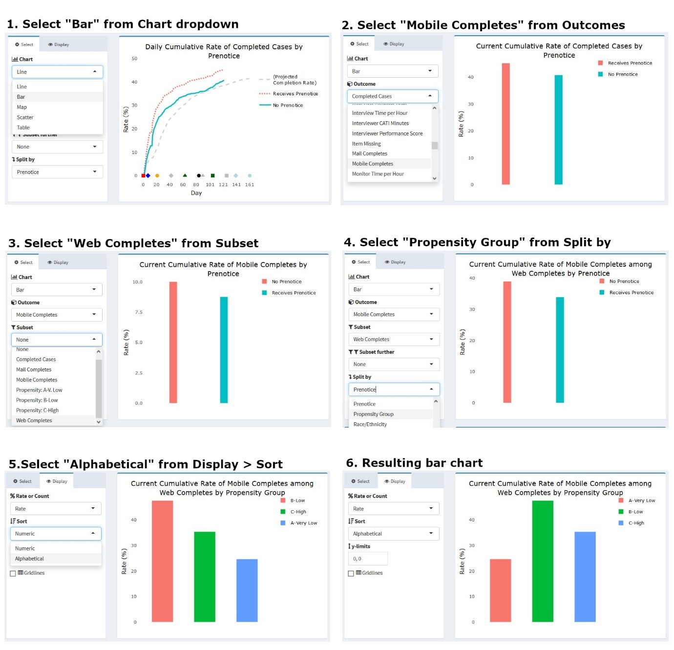
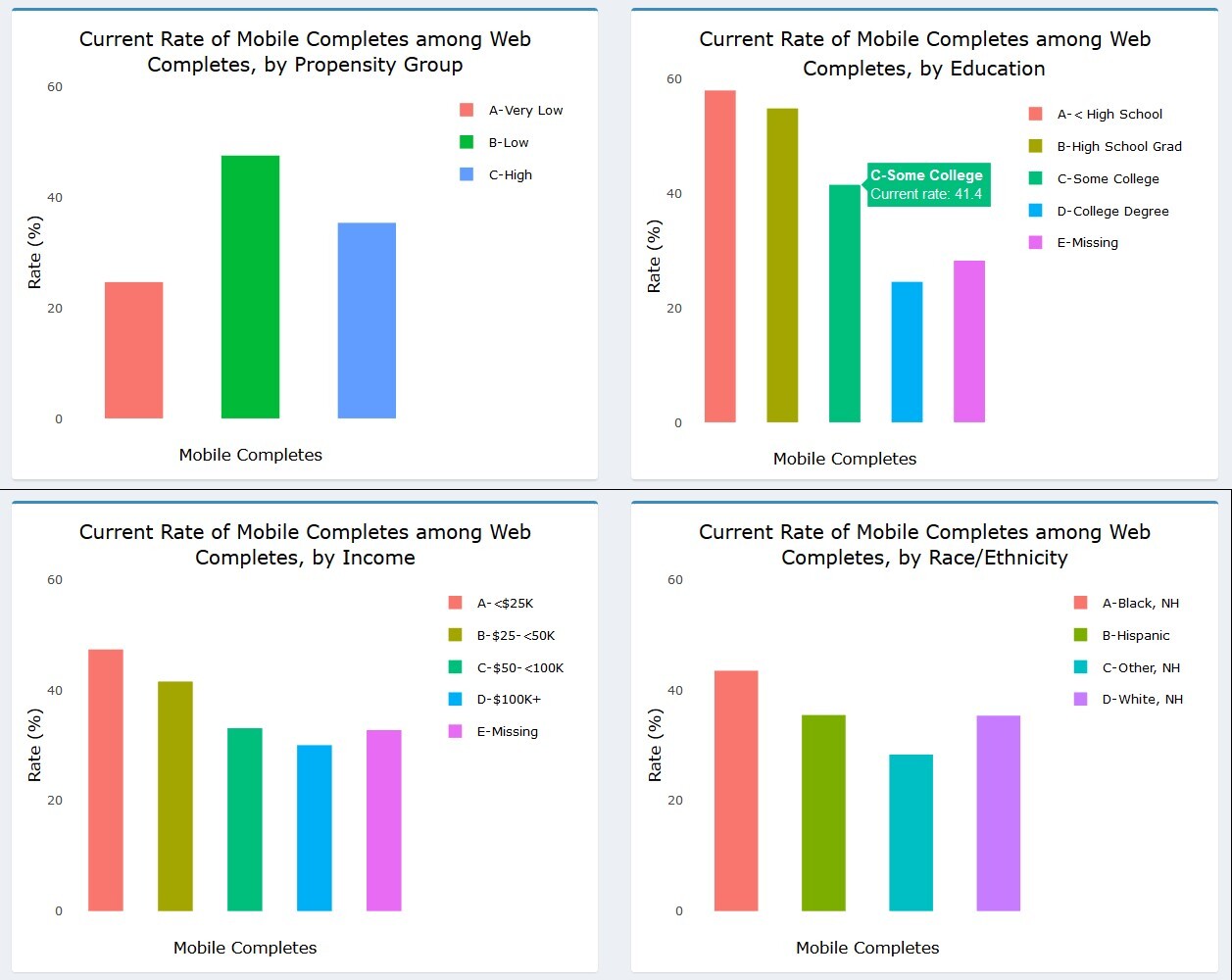
As noted earlier, the dashboard allows a user to change the chart type via a dropdown menu. A project staff member may be interested in viewing, for instance, only the current status of an outcome, split along several sample characteristics captured in prior waves. Figure 10 illustrates how users can modify the chart in Figure 9 to produce a bar chart view of the data. Here, the outcome of interest is the percentage of web completes who took the survey using a mobile device like a smartphone or tablet (rather than a personal computer). Knowing how many respondents and which types of respondents respond via mobile device can inform future releases of the web instrument and data quality investigations, as mobile interaction can differ from personal computers with a traditional keyboard and mouse interface. (Antoun et al., 2017; Peytchev & Hill, 2009). To change the chart type and content, a user can simply select the options of interest under the panel menu items. In this example, users would select “Bar” as the chart type, “Mobile Completes” as the outcome, “Web Completes” as the subset (since mobile completes are a subset of web completes), and “Propensity Group” as the variable on which to split the series. Users may also choose to view the propensity groups in alphabetical rather than numeric order, depending on the specific need.
The multi-panel format of the dashboard allows users to view the percentage of web respondents who used a mobile device to respond along several dimensions simultaneously. As Figure 11 shows, users can see the percentage of web respondents who used a mobile device by propensity group, education, income, and race/ethnicity. From the charts, it appears that those with lower education and income were more likely to respond via mobile. Black, non-Hispanic respondents also used the mobile option more often than other groups. These results could be informative in considering whether any differences in the response experience may differentially impact certain study subgroups.
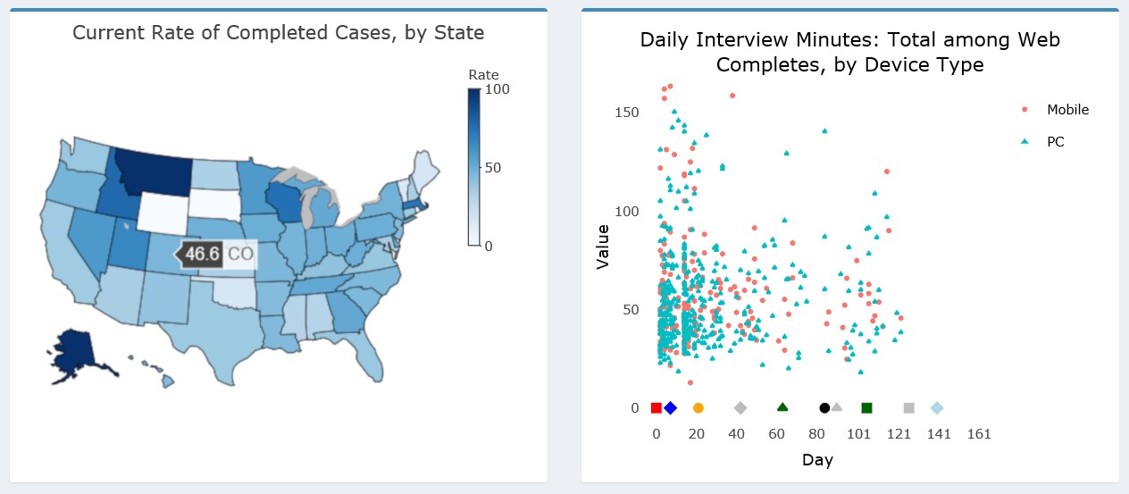
The dashboard supports other charts types in addition to line and bar graphs. For example, users can specify a map or scatterplot from the Chart dropdown. Examples of these charts are shown in Figure 12. (As noted earlier, the Add Health data were perturbed before producing these figures and so the data presented should not be interpreted as actual estimates for the study.) Additionally, tabular views of the data are also available to augment the data visualizations.
The left panel of Figure 12 shows a state-level US map with the completion rate for each state shaded according to the legend on the right. Hovering over any individual state will show the value for that state and its abbreviation (e.g., 46.6 percent in Colorado). The right panel shows a scatterplot view, which may be helpful in gaining a better understanding of the distribution of cases along certain dimensions than a line or bar chart. In this example, we plot the overall administration time of the web survey in minutes by the device type of the respondent. We are interested to know whether points tend to cluster in certain areas of the distribution for either device type and whether clustering or outliers are present during certain parts of the data collection period. We may be concerned to find a large cluster of cases with very low interview times for just mobile devices or just toward the later part of the data collection period, for example.

Although many other metrics were included in the ATD Dashboard for Add Health, we believe the examples we have provided illustrate the breadth of capabilities and applications for Wave V. We discuss enhancements for the future in the concluding section.
Discussion
Wave V of Add Health involved a complex design with several different samples, incentives, materials, and survey modes. It also relied on data from prior waves for planning and strategy development. To actively manage study progress and effectively adjust protocols for subsequent sample releases, the project employed the ATD Dashboard, allowing data collection staff and management to quickly identify trends and drill down to uncover important patterns in the data. Other survey projects in need of similar monitoring can learn from our approach to apply strategies to their own systems. Specifically, we recommend the following guidance for those considering building or enhancing similar dashboards:
-
Identify the key metrics to be monitored during the planning stages of the survey
-
Develop a focused, intuitive design for charts that take into account the diverse needs and roles of users
-
Identify a data taxonomy that will facilitate easy and regular updates to the dashboard to enable near real-time monitoring
-
Consider open-source software solutions that can be combined with other analytic applications (e.g., R and the Shiny framework)
-
Identify sources of burden on programmers and users and work to lessen this burden at every step of the process through simplification and automation. This will ensure the dashboard is maintained and used as appropriate.
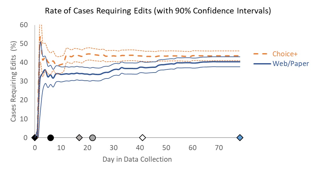
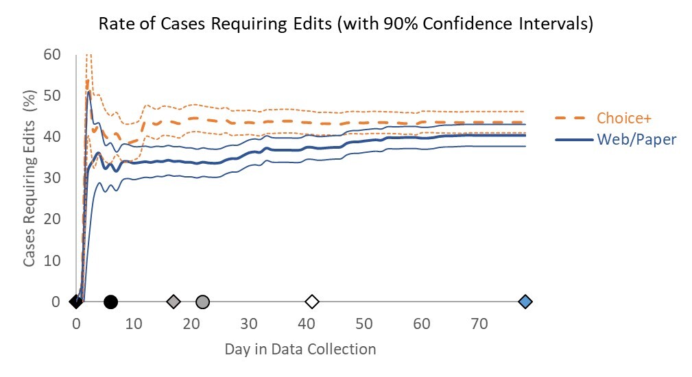
Although the dashboard represented a major improvement over tables and static charts, there are several features we identified for development ahead of the next wave of Add Health. First, we plan to incorporate information on the statistical significance of trends directly into the dashboard. Currently, a user may identify patterns but then must separately calculate significance to determine whether differences observed may be byproducts of small sample sizes rather than true differences. For example, we may include confidence bands around line graphs as illustrated in the non–Add Health example in Figure 13 from Murphy et al. (2018).
Next, we aim to include automated alerts in the dashboard to warn users when prespecified thresholds have been crossed. For instance, if users identify item nonresponse as a key data quality outcome, the dashboard could display a warning when item nonresponse for any individual treatment rises above a certain percentage in the cumulative data. Such alerts might help facilitate an adaptive or responsive design approach for the study in the future. Using the ATD Dashboard to regularly monitor the results of data collection against prespecified targets or thresholds could inform decisions about the timing and use of stopping rules, decisions for treatments to apply to current nonresponding cases, and other interventions. The ATD Dashboard allows for a much quicker deployment of interventions than could be done without such monitoring systems.
Finally, given that Add Health is a longitudinal survey with a wealth of data from prior waves that may be useful for planning purposes, we intend to embed paradata from prior waves for easy access and comparison. These data could be included either in the Projections layer or in a separate layer specifically designed for use for longitudinal surveys.
Having established the interactive framework, we believe the ATD Dashboard will serve the Add Health study and other surveys well in the future. The standardized format of inputs and taxonomy for outputs will help ensure that data collection monitoring can occur in an effective and efficient way, informing interventions and future designs while the survey is still ongoing. The solutions identified in building the ATD Dashboard can be applied in other scenarios in which surveys require the regular review of multiple CTQ metrics for rapid planning and decision making.
Acknowledgments
The authors wish to thank Brian Burke, RTI Add Health Wave V Project Director, for his support of the Adaptive Total Design initiative.